Travelers Insurance
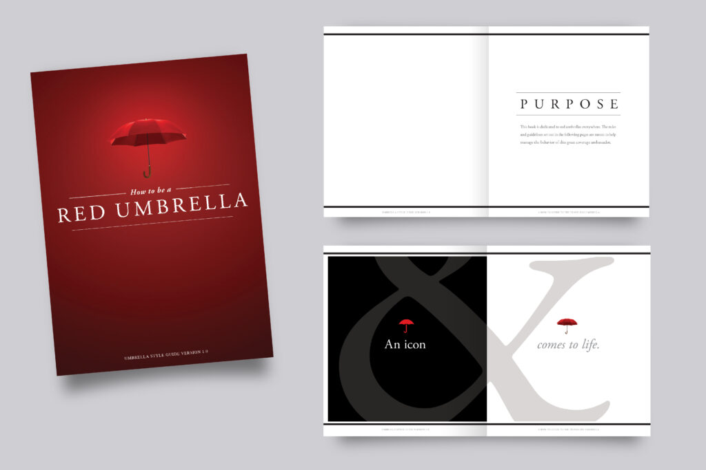
Red Umbrella Style guide
The Travelers Insurance brand is built on trust, reliability, and protection. The Red Umbrella is more than just a logo—it is a symbol of security, care, and unwavering commitment to customers. This style guide ensures that every touchpoint, from digital assets to print materials, consistently reflects these values, reinforcing Travelers’ position as a leader in the insurance industry.
Brand Philosophy
The Red Umbrella represents a promise: to protect, guide, and support customers through life’s uncertainties. Our design choices should always convey a sense of strength, stability, and reassurance.
Core Brand Principles
- Protection & Trust
- The red umbrella stands as a symbol of safety and security.
- The brand’s visual identity should evoke confidence and peace of mind.
- Clarity & Simplicity
- Clean, professional design ensures that messages are easily understood.
- A balance of white space and strong typography creates a trustworthy, accessible aesthetic.
- Consistency & Recognition
- The Red Umbrella must always be presented in a clear, recognizable manner.
- Colors, fonts, and imagery should maintain a cohesive look across all platforms.
Conclusion
The Travelers Insurance Red Umbrella is more than a logo—it’s a beacon of protection. This style guide ensures that every design, communication, and brand interaction reinforces our mission: to provide security, peace of mind, and unwavering support for our customers. By adhering to these principles, we uphold the strength of the Travelers brand and continue to be a leader in the insurance industry.


View the complete style guide here: Red Umbrella Style Guide. We had so much fun making it.
