Southwest Food Excellence: Elementary School
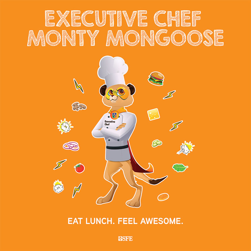
Southwest Foodservice Excellence (SFE), one of the largest and most innovative K-12 food service providers in the country, sought to refresh their brand while retaining the integrity of their beloved mascot, “Monty the Mongoose.” The challenge was to modernize the brand’s overall design without losing the familiar, endearing qualities of Monty, which had been a key part of their identity.
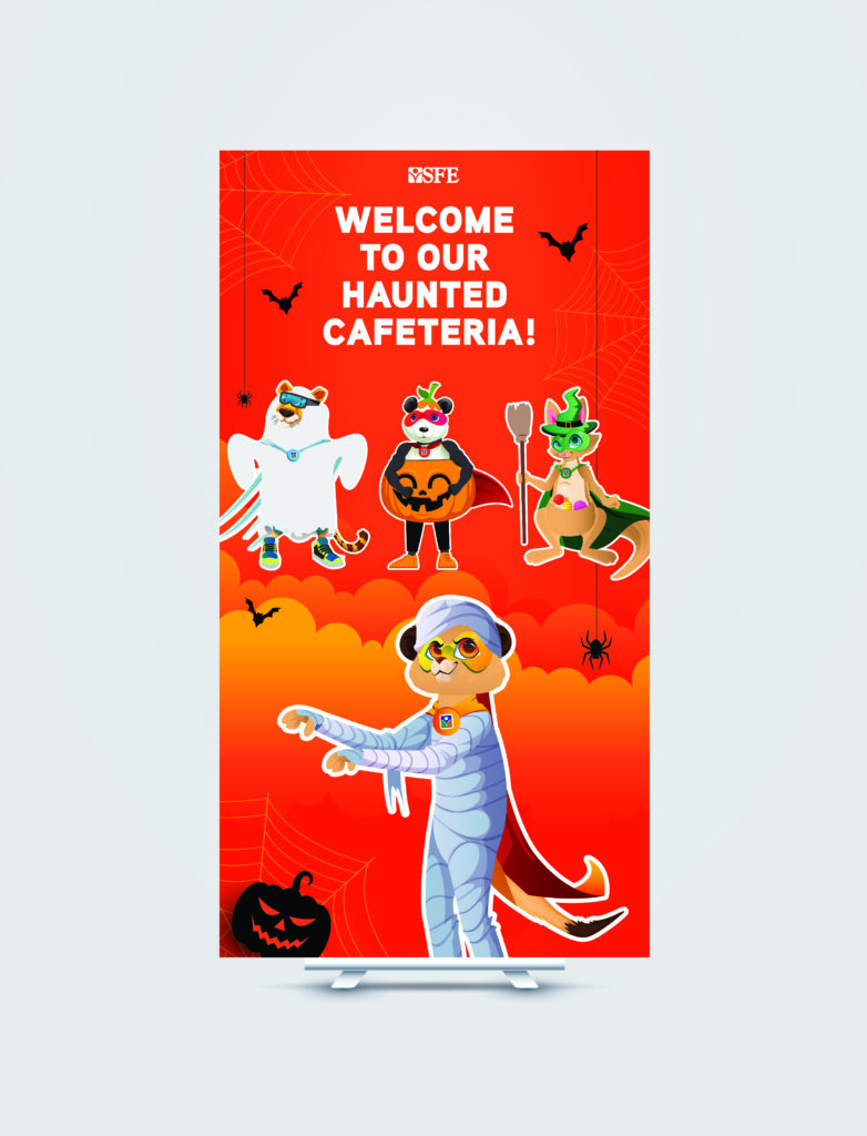
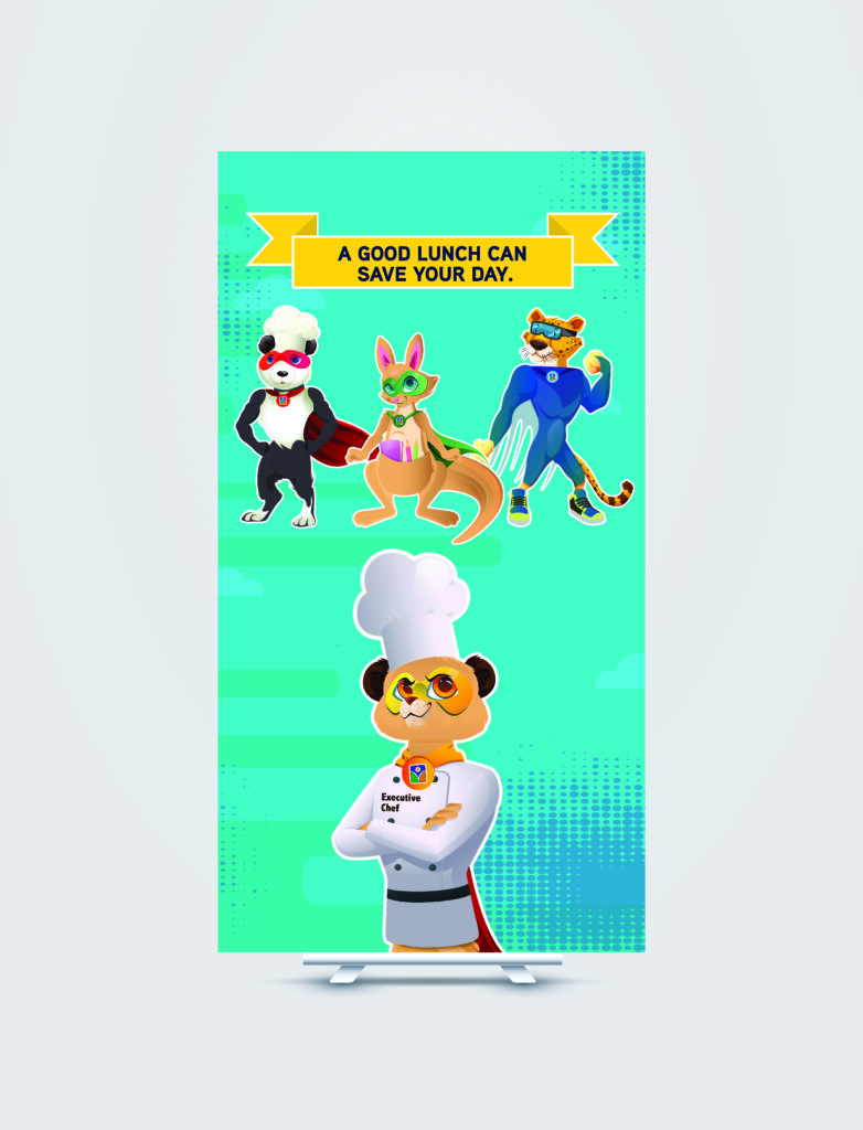
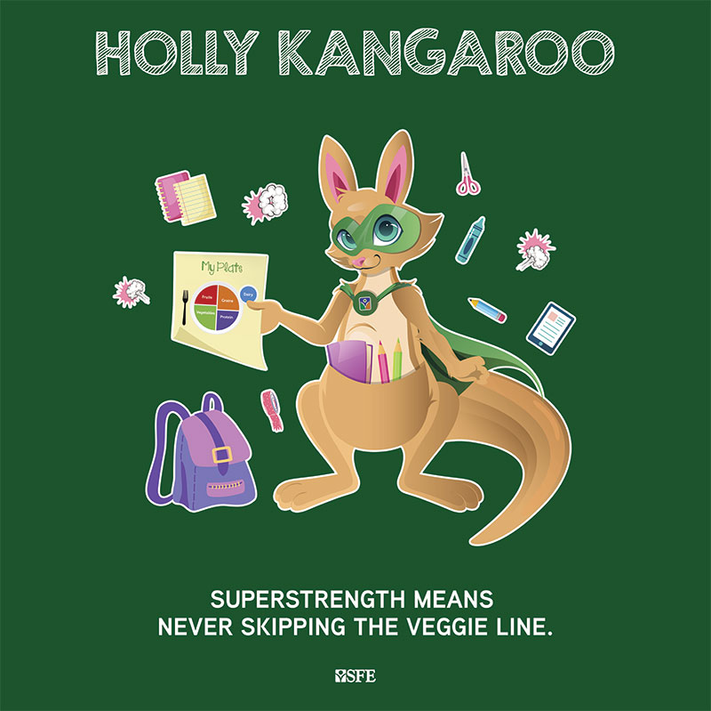
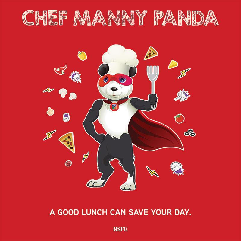
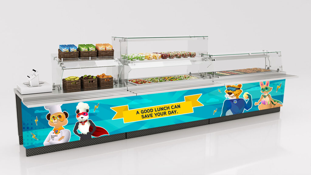
To address this, we focused on revitalizing Monty with vibrant, playful illustrations, incorporating bright, energetic colors that would resonate with their primary audience—children in grades K-5. The aim was to create a visually stimulating and engaging brand experience that captured the youthful spirit of the target demographic while preserving Monty’s friendly and recognizable character.
The updated visual identity aimed to be both fun and engaging, utilizing bold colors and dynamic illustrations to create an exciting look that spoke directly to the youthful energy of students. The refreshed design ensured that Monty remained at the heart of the brand, while the new elements elevated the overall brand appeal, keeping it fresh and relevant for today’s younger audience.
As part of SFE’s brand transformation, we also focused on aligning the brand with their unique differentiators in the competitive K-12 food service market. In an industry dominated by large corporations and “plug-and-play” solutions, our design and strategy teams identified key points of distinction that set SFE apart. These included their “fresh-from-scratch” approach, chef-led leadership by CEO Monty Staggs, and innovations such as the first-ever food trucks in schools and a mobile ordering app. These unique attributes informed our new brand messaging, which emphasized the company’s food-first, “taste the difference” approach, as well as their commitment to innovation. The result was a brand that showcased SFE’s strengths and positioned the company to gain recognition for the outstanding work they were already doing.
The realigned brand positioning, along with the refreshed visual identity, has garnered overwhelmingly positive feedback both internally and externally, helping SFE stand out as a leader in the K-12 foodservice space.
We’re taking SFE into the comic-verse to capture students’ attention in a fresh, exciting way. We create an engaging narrative that resonates with younger audiences by applying a quirky, irreverent spin to our core SFE characters. Our “heroes” embody the key messaging, delivering it with personality and flair, while comic book elements—such as dynamic panels and expressive visual styles—serve as the artistic glue that ties everything together. The tone is less about dramatic “POW!” effects and more focused on fun, flavorful messaging with a “YUM!” twist. All characters in this creative direction are original illustrations designed by me to bring the SFE brand to life in a way that’s both memorable and entertaining for students.
