Keith Clinic
Social takeover for the rebrand of Keith Clinic Estramonte Chiropractic
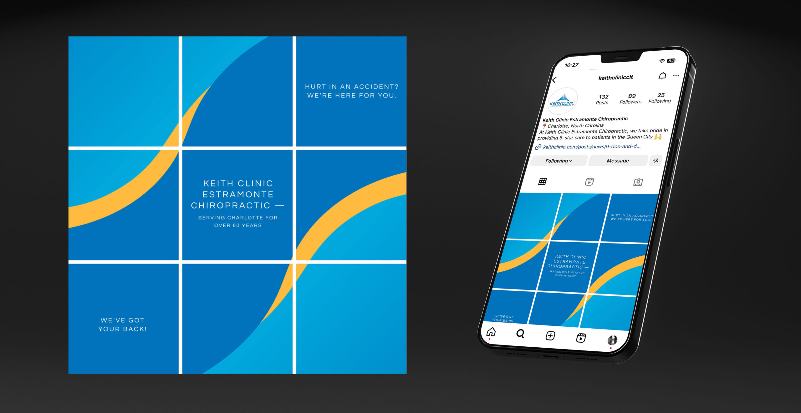
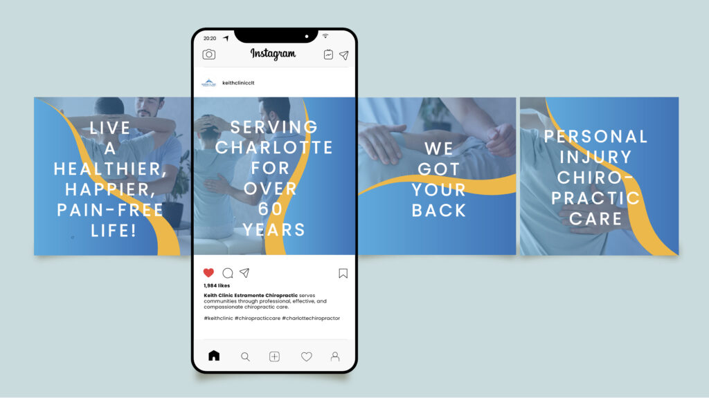
As part of the Keith Clinic rebranding team, we developed a distinctive and meaningful visual identity centered around spinal movement. Given the clinic’s focus on spinal care, we aimed to visually represent the spine’s fluidity, flexibility, and strength, creating a design language that directly reflected the clinic’s mission and expertise in spinal health.
The concept of spinal movement became the backbone of the brand’s overall identity, influencing every design asset and communication piece that followed. We translated this idea into social media graphics by using smooth, flowing lines and subtle animations that mirrored the movement and alignment of the spine. These dynamic, yet simple visual elements communicated the core principles of the clinic—precision, care, and motion—while also providing a sense of energy and vitality.
This theme extended beyond social media and was incorporated into website design, print materials, and other digital assets, ensuring consistency across all touchpoints. The fluidity and movement embodied in the graphics not only reinforced the clinic’s focus on spinal health but also helped establish a modern, approachable, and cohesive brand presence.
Moving forward, this concept served as the foundation for Keith Clinic’s visual identity, influencing the design of new materials and the creation of future assets. The spinal movement theme provided a solid, adaptable framework for continued brand development, allowing the clinic to build a recognizable and unique brand that stood out in the healthcare space.

